0 Comments
Part 1
1.How do you feel after watching that video? I feel like I learned a lot about how some designs can inhibit some people and how we should be more thoughtful of how design should benefit more people and take into account the differences for everyone. 2.As a designer, what could be done to make experiences better for Sinéad? A designer can take into account the differences between people and use that when designing different products. 3.When you think about how it is to experience life the way she does, what is that called? Empathy Part 2
Part 3: List:
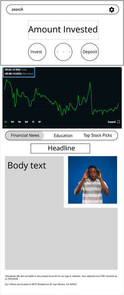
Another app that has good user experience is chrome. It is very easy to use. The placement of the icons is very clean and easy to find what you are looking for. There there is imagery when you search something and it shows you a quick preview of the information There is hierarchy because when you first search up something, your eyes first go to the preview and then the links. Underneath the links there is a preview of the information you are going to get on the website. The logo has a bit of color and everything else is a shade of white and this probably because google is suppose to not be bias and everything it shows you on the website is truthful.
1.Aerospace Engineer base salary - $122,270
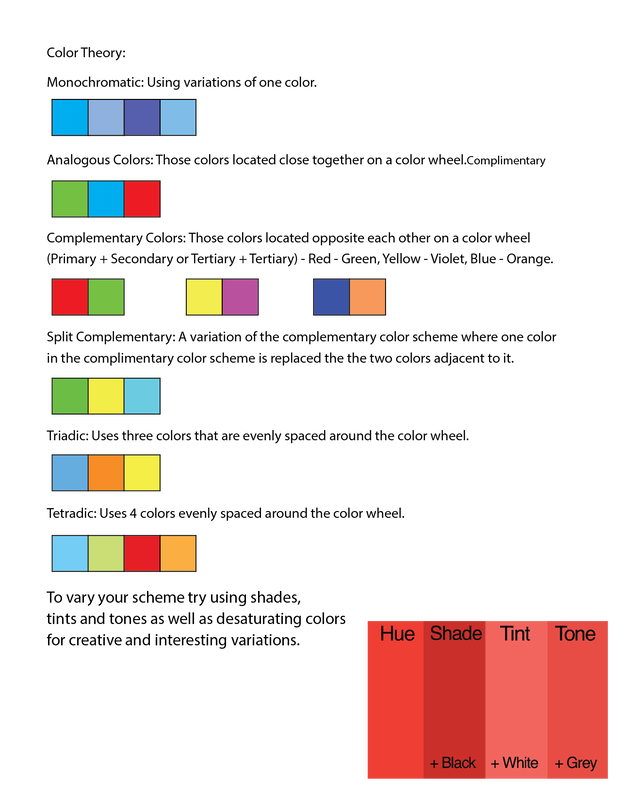
2.I would live in California and my tax bracket would be 9.3 percent. 3.I have to pay $29,344.80 in federal taxes 4.I would have $7,066.72 per month 5.I would probably have enough money left over to eat. If rent was 4,000 because I live in California and if i spend 2,000 dollars on stuff like insurance and food. I would still have around 1,000 dollars left to do other stuff. 6.I might think of living in a different state because of the taxes in california. If I lived in a state with no state tax, I would have an extra 600 dollars a month, but jobs would also harder to find and the pay would be lower. So I would probably stay in California if I can. 7.They pay for Social Security, Medicare, Veteran benefits, education, and National Defense. The colors used in Nasa logo are white, blue and red and it is a complementary color scheme. The colors used in IKEA logo are blue and yellow. It is a complementary color scheme.
|
AuthorWrite something about yourself. No need to be fancy, just an overview. Archives
March 2023
Categories |


 RSS Feed
